Elementor Popup Not Working? Check Conditions, Triggers and Advanced Rules
An Elementor popup needs conditions, a trigger and passing rules before it shows. Check each in order, plus the multiple-popup option and…
When the Elementor mobile view is not working, the cause is usually a device-specific value, a hidden element, an overflowing container or a cached copy. Test each one in order.
Elementor mobile view not working can mean several different things: a layout that breaks on phones, a setting that will not apply, an element that vanishes, a page that scrolls sideways, or a live site that still shows an old copy. Elementor stores a separate layer of values for each device and inherits from larger screens to smaller ones, so the fastest fix is to find which layer is wrong, not to keep adjusting numbers.
First check how Elementor defines “mobile” on your site (the breakpoint). Then check each device in turn: is the value set for mobile, or inherited? Is the element hidden on mobile? Is the stacking order right? If the page scrolls sideways, find the element that overflows. If everything looks right in the editor but not on a real phone, clear Elementor’s files and your caches.
How this guide was prepared: the steps follow Elementor’s help articles listed under Sources, read on October 19, 2026. We did not reproduce these layout problems on a live Elementor site for this guide, so the steps are research-based. Controls differ between the sections-and-columns layout and Flexbox Containers, and between Elementor versions, so your panel may look different.
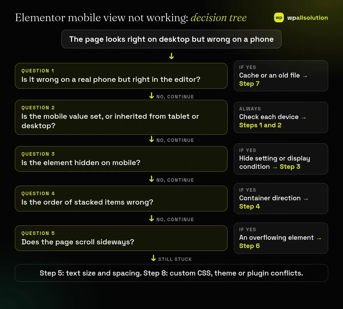
| What you see | Likely cause | Start with |
|---|---|---|
| Looks right in the editor, wrong on a phone | Cached or stale files | Step 7 |
| A change on desktop does not reach mobile | A separate mobile value overrides it | Step 2 |
| An element is missing on mobile only | Hidden on that device, or a display condition | Step 3 |
| Two columns stack in the wrong order | Container direction | Step 4 |
| Text too big or no margin on small screens | No mobile typography or padding | Step 5 |
| Page scrolls sideways | An element wider than the screen | Step 6 |
Elementor’s responsive editing article explains that, by default, the editor treats widths above 1024 px as desktop, between 767 px and 1024 px as tablet, and below 767 px as mobile. The point where the layout switches is a breakpoint, and your site may use custom ones. Use the device icons in the editor top bar to preview each width, but also open the live page on a real phone. In Chrome, the browser’s own device mode (open Inspect, then Ctrl+Shift+M) is another quick check. An emulator is helpful but not identical to a phone.
Elementor values cascade from larger screens to smaller ones. According to the help article on inherited responsive values, a change on a larger breakpoint passes down to smaller ones, but a change on a smaller breakpoint does not affect the larger one. A value set specifically for tablet or mobile replaces what would have been inherited. Widescreen is the exception and does not affect other devices.
The inherited-values article applies to the sections-and-columns layout. For Flexbox Containers, Elementor points to its separate responsive editing guide.
Select the widget or container, open the Advanced tab, then the Responsive section, and see whether any device is toggled to Hide. Also check Display Conditions: Elementor says they do not take effect until you Save or Publish the page. If an element seems to be missing in the editor itself, open the Structure window, because overlapping elements, negative margins or absolute positioning can hide it.
Elementor’s mobile layout article says Flexbox Containers stack vertically by default. To show the right-hand item first on mobile, enter responsive mode, select the parent container, open the Layout tab, find the Items section and click the column reversed icon. Do this only in Mobile view, so the desktop order is not affected.
Settings with a responsive icon next to them can have a value per device. Use that to reduce font sizes for phones, add padding so text does not touch the edge of the screen, and define the vertical gap between stacked widgets. Elementor’s article notes this styles mobile without changing desktop.
Elementor’s article on the horizontal scrollbar says it comes from an element that overflows. Two ways to find it:
[...document.querySelectorAll('*')].filter(e => {
  const r = e.getBoundingClientRect();
  return r.right > document.documentElement.clientWidth || r.left < 0;
}).forEach(e => { e.style.outline = '1px dotted red'; console.log(e); });Once you know the container, fix the cause, such as a fixed width or negative margin. Elementor’s article also shows a quick fix: select the container, open Layout → Additional Options and set Overflow to Hidden. Use it with care, because hiding overflow can clip shadows, dropdown menus or content that was meant to be visible.
If the layout is right in the editor but not on a real phone, follow Elementor’s cache steps: go to Elementor → Tools and click Clear Files & Data, then clear your caching plugin, host and CDN caches, and any object cache. Elementor Hosting customers can also clear object caching from the My Elementor dashboard. Test in a private window on your phone. Our guide Elementor changes not showing goes through every cache layer in order.
If the steps above do not explain it, custom CSS with fixed widths, a theme stylesheet or a plugin can override mobile settings. Test on staging: temporarily disable custom CSS, switch to Hello Elementor, and deactivate plugins one by one. How to find the plugin that broke your site explains the method. If the editor itself is not loading, see Elementor editor not opening.
A value set only for mobile (or tablet) overrides what would be inherited from desktop. Clear that value (Step 2).
It may be set to Hide on mobile, or a display condition may apply (Step 3).
It can work, but it can also clip content. Find the element that causes the overflow first.
A cache or stale generated file. Clear Elementor’s files and your caches (Step 7).
Work through the steps in order. If the Elementor mobile view is still not working, note the page URL, the device and browser, and the steps you tried, then ask Elementor support or your host. If you would like a person to look, wpallsolution offers independent plugin support, and our Elementor development page explains how we build responsive Elementor sites. We cannot promise a fix without seeing your site.
Last reviewed: October 19, 2026. Elementor is a trademark of its owner. wpallsolution is not affiliated with or endorsed by Elementor.
An Elementor popup needs conditions, a trigger and passing rules before it shows. Check each in order, plus the multiple-popup option and…
The free Elementor plugin covers more than many expect, but Pro adds the Theme Builder, popups, forms and WooCommerce tools. See which…
Moving from Elementor to a block theme is a rebuild, not a switch. Use this checklist to audit, test on staging and…
Black FridayCyber Monday sale
Before you go,
Our biggest discount of the year on the first payment of every maintenance plan.
BF2026 at checkout